(UNNAMED) - Social App
Design System, UI and Prototype for a Social Startup

Design System - CASE STUDY
1. Overview

The product was a social platform designed to help people connect around events and invitations. While the core business model and initial concept were already defined, my responsibility —as the sole interaction designer— was to bring coherence and scalability through a design system.
My goal was to ensure consistency across mobile and desktop, improve accessibility, and enable the team to scale quickly without losing visual or functional clarity.
The challenge was twofold: to remain faithful to the brand principles while adapting them to best practices, and to ensure that the system could evolve alongside a fast-moving social product.
2. Goals & Challenges
Goals
-
Establish a scalable system of tokens and components.
-
Ensure visual and functional consistency across all flows.
-
Provide developers with clear guidelines to accelerate implementation.
-
Enhance accessibility with readable typography, adaptable colours, and clear states.
Challenges
-
Adapting a bold brand identity to digital best practices.
-
Designing for both mobile and desktop grids.
-
Supporting light/dark mode and multiple interaction states.
-
Simplifying a feature-rich product into an intuitive, learnable interface.
3. Process
I began by building a style guide grounded in the existing brand identity, refining it for digital environments.
1. FONTS & COLOURS
-
Typography pairing: The brand identity relied on Bauhaus Std, a geometric and expressive typeface. While strong for display purposes, it lacked readability for UI at small sizes. To solve this, I paired it with Avenir, chosen for its clarity on mobile screens and its complementary visual tone. This pairing ensured the brand voice remained distinctive while maintaining accessibility in everyday use.

-
Bauhaus Std → expressive, geometric, for titles & brand moments.
-
Avenir → modern, highly legible, for UI and continuous reading.
-
Pairing → balances character with usability.
-
Colour palette: I extended the brand palette with darker and lighter shades, contrast colours, a versatile grey scale, and alert colours. This provided the flexibility needed for accessibility, hierarchy, and state indication.

2. COMPONENTS
I designed bespoke icons aligned with the brand, adaptable across mobile and desktop grids.
A full library of reusable UI components was created — buttons, toggles, inputs, cards — with documented variations and interaction states (hover, pressed, disabled).
These components followed relevant design trends in the local market while remaining flexible for future evolution.

UI Components Library

3. INTERACTION FLOW
I expanded the basic user flow into a complete interaction model:
-
Defined all required screens and states for each user journey.
-
Structured navigation around the app’s core actions: Create Event and Accept Invitation.
-
Ensured users always knew their location through consistent navigation patterns.

4. SCREENS & PATTERNS
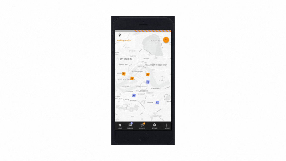
The UI design simplified a complex feature set into an intuitive, perceivable, and learnable experience. Layouts were designed for clarity, prioritising key actions and reducing friction.


Each screen applied the design system’s tokens and components, ensuring consistency and scalability.


4. SYSTEM IN ACTION
The UI design simplified a complex feature set into an intuitive, perceivable, and learnable experience.
4. Results / Impact
-
Scaled from dozens to over 100 screens without losing consistency.
-
Reduced design time for new features by standardising tokens and components.
-
Enabled smoother collaboration between design and development through documentation.
-
Delivered a product that balanced a bold brand identity with practical accessibility.

5. Learnings
-
A design system is not just a set of components but a shared language between designers and developers.
-
Documenting the why behind decisions is as important as the what.
-
A strong system must remain alive — regularly reviewed and adapted as the product evolves.
-
Pairing expressive branding with functional clarity is key to ensuring both identity and usability.
6. Conclusion
This project strengthened my skills in mobile UX and data visualization, highlighting the importance of designing for both usability and scientific integrity.
It also reinforced my ability to turn technical complexity into interfaces that are human-centered, accessible, and easy to adopt in daily practice.