MONITORING HONEY BEES
A citizen science project
A collaboration at NCBS (National Center for Biological Science), Bangalore, India.

Monitoring Bees - CASE STUDY
1. Overview

The project was a citizen science mobile app designed to support beekeepers in monitoring the health of their hives. As the sole interaction designer, my role was to translate complex data into an interface that was both intuitive and accessible in everyday use. At times, I also involved my design students in the process, bringing them along to observe, co-create, and learn from real-world user research.
2. Goals & Challenges

Goals
-
Provide quick access to key hive metrics.
-
Design clear data visualizations optimised for mobile.
-
Enable timely alerts for critical events (temperature drops, hive activity changes).
-
Create an interface usable by both professionals and non-technical users.
Challenges
-
Designing for rural contexts with limited connectivity.
-
Balancing scientific accuracy with usability for everyday users.
-
Displaying complex data on small screens without overwhelming the user.
3. Process
1. RESEARCH & INSIGHTS
I gathered insights from beekeepers and citizen science practitioners, focusing on pain points such as limited connectivity and difficulty interpreting sensor data.
These findings shaped the app’s priorities: clarity, offline support, and intuitive flows.
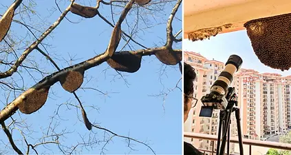
Photo credits: Vinayaraj, CC BY-SA 4.0 (left), Rajani Mani (right)
2. USER FLOWS
I expanded the initial concept into clear task-oriented flows, focusing on:
-
Checking hive status.
-
Receiving and understanding alerts.
-
Reviewing historical data.

3. WIREFRAMES & PROTOTYPES
Low-fidelity wireframes allowed quick iteration on layouts, followed by high-fidelity prototypes tested on mobile.
The design moved from raw data tables to visual dashboards with icons, colour codes, and charts for rapid comprehension.

4. UI DESIGN
The visual system used earthy and natural tones combined with alert colours for urgent notifications.
Simple custom icons helped communicate hive conditions at a glance.
Graphs were designed with minimalist charts to highlight only the most relevant information.


4. SYSTEM IN ACTION
The design system came to life through the app’s main flows, demonstrating how typography, colours, icons, and components worked together in context.
-
Hive Dashboard → consolidated hive metrics into a clear, mobile-friendly overview.
-
Alerts → highlighted critical changes with colour-coded notifications and simple iconography.
-
History → allowed users to track hive performance over time with lightweight, scrollable charts.

4. Results / Impact
-
Enabled beekeepers to quickly interpret hive data on mobile devices.
-
Supported decision-making in environments with limited internet connectivity.
-
Translated complex sensor inputs into clear, actionable insights.


5. Learnings
-
Designing for low-connectivity environments requires lightweight flows and offline-first thinking.
-
Data visualization for mobile must prioritise simplicity and clarity over exhaustive detail.
-
Collaboration with domain experts is key to making scientific data accessible to non-experts.
-
Citizen Science demands democratic interfaces that can be operated by every social group regardless of their functional abilities.