Shared Museum — From Accessibility to Living Systems
Designing a scalable, empathic design system for digital culture.

Problem:
The starting point for Shared Museum was a simple but essential question:
How can a digital cultural experience be truly accessible — technically and emotionally?
Solution:
The brief combined two goals: to audit accessibility across diverse CMS environments, and to explore how a shared design system could harmonize interfaces for museums, schools, and curators.
I. Accessibility Finding — Quick Audit
Purpose: establish rigor, accessibility mindset, and technical foundations.
The audit followed the principles of WCAG 2.1 (AA/AAA levels),
but applied through a broader lens: observing how design communicates, guides, and welcomes.
Main actions included:
-
Color-contrast analysis of buttons, backgrounds, and text.
-
Review of typographic scales and weights across viewports.
-
Hierarchy and spacing tests to ensure perceptual clarity.
-
Observation of visual feedback and interactive states.
Each test combined automated tools with manual visual inspection.

1. Context & Methodology
Brief, scope, WCAG 2.1 principles, tools used.
3–4 main accessibility issues (contrast, typography, hierarchy, feedback).
The audit revealed several tensions between aesthetics and usability:
-
Insufficient contrast in secondary buttons and text placed over rich backgrounds.
-
Unstable typographic hierarchy, with abrupt jumps between subtitles and body text.
-
Irregular spacing within form elements and modals, hindering sequential reading.
-
Lack of clear feedback in critical actions (submit, confirm, close).
These insights were not only corrective; they uncovered how poetic intention and functional clarity could coexist.
.jpg)
2. Key Findings
3. Quick Iterations
Corrections implemented (color tokens, 8px grid, button states).
From those findings, immediate improvements were implemented:
-
Normalized color palette using tokens (primary, neutral, accent).
-
Minimum contrast raised to 4.5:1 for main text and 3:1 for decorative elements.
-
Simplified visual hierarchy based on two key typefaces (Fraunces + Inter).
-
Introduced a consistent 8 px baseline grid.
-
Refined hover, active, and focus states with subtle yet accessible indicators.
The result was a more balanced and legible system — one aware of both rhythm and tone.

4. Learnings
Transition statement connecting audit → system.
The audit revealed that accessibility is not an external layer but a way of seeing — a method of translating empathy into structure and care into visual decision.
This diagnostic exercise improved immediate usability,
but more importantly, it opened a deeper question:
Could a design system adapt emotionally and culturally to its users?
The audit reframed accessibility as empathy. That insight became the foundation for the Living System Sprint — an exploration of how design systems can adapt emotionally and culturally.
an experimental exploration in which the audited system evolved into a living ecosystem,
capable of modulating color, tone, and movement according to each human context.

Conclusion
The audit reframed accessibility as empathy — becoming the foundation for the Living System Sprint.

II. Living System Sprint — From Structure to Behavior
Purpose: evolution from audit to expressive system design.
System overview – palette, typography, grid tokens
The design system establishes its rhythm through a limited set of foundations: color, typography, and modular structure. Each component is conceived as part of a living grammar rather than a static library.

1. Core Component — The Dialog
Structure, slots, consistency.

The Dialog became the heart of the system — a flexible container designed to host different emotional tones and interaction types while maintaining structural consistency.

2. Patterns of interaction
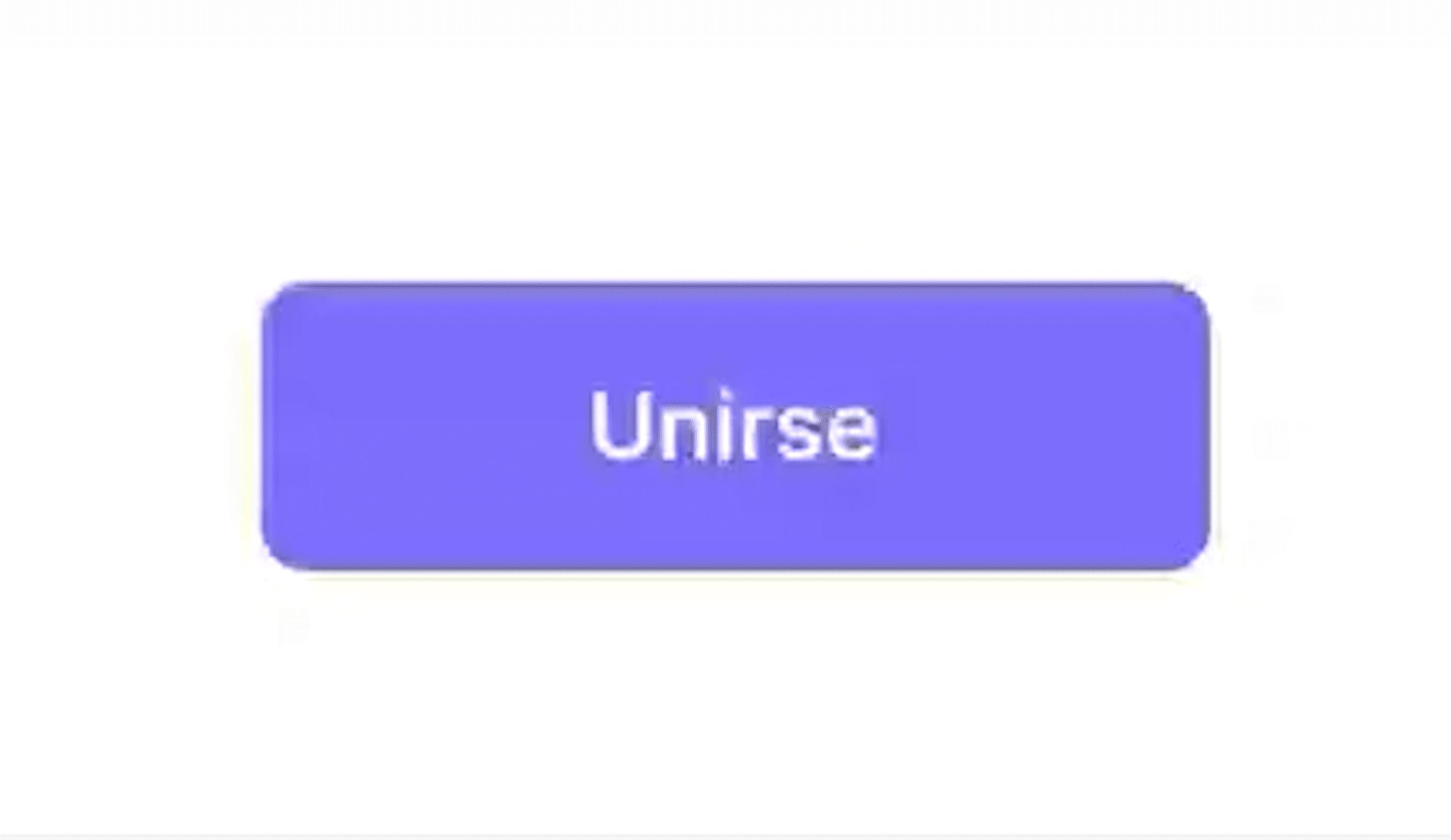
Interaction patterns emerge as extensions of this core: Join, Play, Confirm. Each represents a specific mode of human connection — invitation, contemplation, closure.

3. Adaptive themes
Visitor · Museum · Curator · School.

The system adapts to its users through color, tone, and motion. Visitor dialogs evoke warmth; Museum versions convey trust; Curator ones spark contrast; and School modes encourage clarity and learning.

4. Motion & Microinteractions
Fade, scale, drop animations.
Movement becomes the invisible thread connecting form and feeling. Each transition breathes, waits, and responds — making interaction feel less mechanical and more conversational.
Conclusion
Designing through living systems means understanding that accessibility is not a checklist but a rhythm — a way for interfaces to breathe with the people who inhabit them.

Accessibility is empathy in motion
III. Reflection — Designing through Living Systems
Building an adaptive, human-centered design system for digital culture.
Designing through living systems means recognizing that accessibility and beauty are not opposites but continuations of the same gesture.
Reflection — Designing through Living Systems
Designing through living systems means recognizing that accessibility and beauty are not opposites but continuations of the same gesture.
Every component, every state change, is an act of listening:
listening to how people move, how they read, how they pause.
The Shared Museum System is not a finished product —
it’s a framework for continuous dialogue between culture and technology,
a space where design learns to breathe with its users.

IV. Documentation & Impact
1. Process summary
Timeline: Audit → System → Patterns → Motion → Reflection.